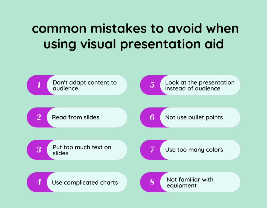
Let’s first clarify what we mean with ‘visual presentation aid’. In this article visual presentation aid shall include any visual medium used in the context of a speech or presentation. This can be an info-graphic, a short film or of course good old fashioned slides or a flip chart. I will focus on slides, simply because it is still the most widely used and misused form of visual presentation aid.
Why are we using visual presentation aid?
Although at first it seems very obvious, it’s worth quickly reflecting on why we actually use visual aids during a presentation.
Reasons to include a visual aid in your presentation
Increase the clarity of your message
There is plenty of evidence showing that the transmission of information through more than one channel increases the retention rate. It is therefore no surprise that the use of a visual aid to support your voice can help you to get your message across with a bigger impact.
Make your presentation more entertaining
It can be a good idea to use visual aid to get the audience more engaged. However, if your goal is to create entertainment, you have to be a bit more creative. You could for instance use a short video clip or live polls.
Keep your audience focused
I tend to get easily distracted if I am only listening to a person without a visual frame to focus. Having a visual aid in front of you, can help stay focused on what the presenter is saying.
Despite the benefits mentioned above, there are some good reasons why you could decide not to use a visual presentation aid. Make sure you assess whether you it makes sense or not to spend time on preparing a visual aid or not.
Reasons to not include a visual aid in your presentation
You are short of time
If you have very limited time to prepare, you should probably not waste hours making slides. It takes time to get it right, so you might just end up having mediocre material and a badly prepared speech. It’s probably best to focus on doing one thing right.
You need more connection with your audience
If you need to create a stronger personal link with your audience, then dimming lights and getting people focused on a screen instead of you is probably not the right thing to do.
You have a good narrative
If you have a good narrative already, for example you are planning to tell your audience about personal experiences or example stories illustrating your point, then this is what you should focus on and slides might just disturb your performance. Stories are more captivating than any slide you can imagine, due to our ability to remember information shaped in narrative form.
Two pieces of advice to make a difference
One key message per slide
Your visual aid is only meant to support your oral presentation, not the other way around. When you use a visual presentation aid, your audience has to process information both acoustically and visually at the same time. In order to avoid system overload of your audience, I recommend focusing on only 1 key message per slide, the simplest possible way and with as little text as possible.
My toughest experience probably comes from my time working in Japan. Japanese are notorious for their pathological attention to details. This can be an issue when you prepare slides for them because they can get confused by every little misplaced dot or formatting issue on the presentation.
The key is therefore to put the minimum information required to avoid confusing your audience but enough to deliver the essence of your message. This is a subtle art that takes a lot of practice until it runs like a well oiled machine.
Your key message should be written in larger font, as a bullet point. Again only one key message per slide. You can explain everything around that message verbally.
One simple chart per slide
Whatever profession you have, web designer, online marketer, or even doctor you are likely to be exposed to data analysis. Understanding and presenting your data is therefore a must if you want to succeed. It’s a common thing to use charts in slide decks. This makes sense because most people are visual learners and raw data is probably only of interest to color blind accountants.
However, charts should be used with parsimony and they should exclusively support your key message. It can be ok (actually not) to squeeze in many charts on one page with complicated curves, if you are writing a report for financial analysts plagued by insomnia.
However, if you are presenting to a client who didn’t see your analysis previously, then you should adopt a minimalist approach to presenting your data. Over-complication is not a proof of competence but only a way to hide the lack of substance in what you are doing. Make it meaningful, simple and clear and your clients will value it.

How Vennquest Can Help You to Find and Manage Your Group
We created Vennquest to make it easy to start or find groups for practical projects in many different areas. If you’re curious to see how much easier it is to practice skills together in groups then why don’t you sign up and join a group that interests you. We will immediately be in contact with you and help you to find some group members and to get the whole thing started. Join our beta test phase now and finally get the practice that you need to do the things you always wanted to do.
Sign up for Vennquest here:
Or learn more about our Public Speaking Practice group:

